Nome Schoolhouse: Renovation Brings More Than Learning Back to the School

The Nome Schoolhouse in Nome, North Dakota is currently being renovated by two local business owners with a dream.  They saw the schoolhouse as the perfect opportunity to combine their businesses, educate others on their business lines and provide a building for the community to use for education, events and socializing.

Who is Behind the Renovation

Chris Ambrust and Teresa Perleberg are North Dakota business owners in a unique industry. Their story is interesting on how together their businesses could build great things.

Chris is the owner, Dakota Fiber Mill, the only full-service fiber processing mill in the Dakotas. Dakota Fiber Mill processes raw fiber (wool, alpaca, bison, goat etc) into yarn and roving. Teresa Perleberg is the owner of Bear Creek Felting. Teresa is a master in the art of needle felting. She has an online academy which offers members access to online tutorial courses instructing how to needle felt various pieces of art. She also raises a large herd of sheep for the wool to use in her kits and supplies which she sells online as well. 

Chris has been processing the wool for Teresa for over 10 years. Over that time, they became friends and two years ago collaborated on a wool needle felting cushion. The demand was extremely high and in the spring of 2018 a lightbulb went off for the business partners. Chris had an extra acreage not being used and her mill was busting at the seams. She knew she needed to expand her current building or build new. At that point Teresa’s daughter had just returned from college seeking to become a chef and open a catering business. That is when the lightbulb turned on! The idea was to build a facility that would house not only the mill but guest rooms, classrooms and event space as well as food and beverage. Teresa was on board and Hence Shepard Industries was born.

Renovation Inspiration

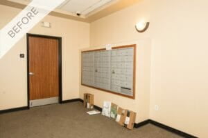
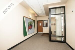
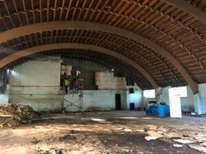
The idea of building new was tossed around but both Chris and Teresa love old buildings which brought them to the idea of renovating one of the forgotten and deteriorating schoolhouses in the area. They “schoolshopped” and fell in love with the Nome Schoolhouse! It was decommissioned fully in 1970, purchased and used mainly for storage. For the past 10 years however, it has been sitting empty.

The business partners prayed for guidance and support. They found out the budget they had originally planned on was much lower than what it was going to take to make their dream a reality. “We became very anxious on the cost, as we were trying to demo all the debris and rotted areas and coordinating engineers ourselves, not having a clue on all the engineering it was going to take before rebuilding started. So many people told us we were crazy and will never be able to finish the project and that we were in way over our heads. All these comments just fueled our fire of determination,” Chris stated.

In the Spring of 2019, the decision to continue or back out had to be made. “We ‘threw out our fleece’, so to say, in the form of a kick starter campaign which is similar to a Go Fund Me campaign but for start-up businesses. You come up with an amount you are going for and if you meet that goal you get the funds, if you don’t meet the goal you do not,” Chris explained. The campaign earned more than they had anticipated. In addition, a successful Nome Alumni helped cosign the loan. The project was moving forward!

Renovation on Phase 1

As they quickly discovered, Chris and Teresa needed help coordinating the renovations. They hired Roers as the Construction Management company for the project. “We have been so pleased with everyone at Roers!  It was such a relief to have them take over everything. A big relief as well was how the superintendent on site is handling the actual demo and rebuild. We are saving as much of everything in the school as we can and the crew has been amazing at going out of their way to save wood, doors, molding, etc.  We believe they have grown to love the school as much as we do. We couldn’t imagine having a better team onboard with us,” Chris remarked.

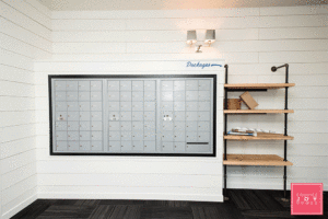
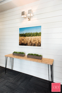
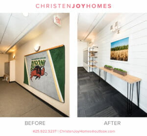
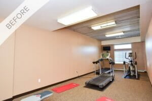
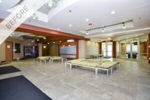
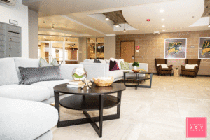
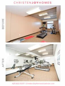
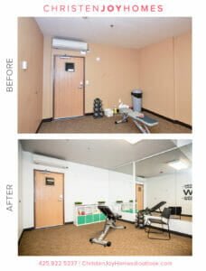
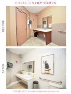
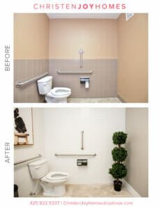
Phase one, the gymnasium is now complete. Wood salvaged from an area of the school that had collapsed and needed to be demoed is being used for a bar, shelving and covering support beams. The fire escape steps are being used to access a mezzanine added above the bar, catering kitchen and restroom area which were built.

Phase 2 Making Progress

Phase 2 of the renovation will include the rebuild of the back area of the school. The area will be expanded and include renovations of the existing classrooms and the addition of the guest rooms.

The Roers crew completed 
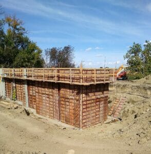
the footings of the addition, with walls to follow. The goal of Phase 2 is for the front of the school to mimic the original front of the building. As you enter the school from the front and walk up the stairs, holding the gorgeous wood railing that so many students have done so before, and step into the main hall, it will look exactly like it did in 1916 with classrooms to the left and right. You will not see the large addition behind the school to the east. “We cannot wait to hear the memories that will flood the minds of those past students,” commented Chris. 

What the Future Entails

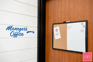
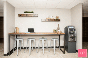
The gym currently houses fiber arts classes as well as the offices for Hence Shepard Industries. Small events are being held and regular open hours for food and beverage to be enjoyed. 

The completed schoolhouse will house several entities. The schoolhouse itself is a 501c3 non-profit. Hence Shepard Industries will rent space from the school. The old barn, just steps from the back of the school, will house an education herd of fiber animals. A variety of sheep, alpacas, llamas, camel, goats, rabbits and more will be onsite for groups to be able to view and be educated on where natural fibers come from.  Visitors will be able to view the fiber from the goats which create cashmere sweaters. The sweaters can be purchased at Macy’s. The bottom floor of the addition houses the processing mill and packaging area for the products made onsite. 

The facilities will offer a variety of classes on fiber arts and crafts, as well as all-inclusive retreats, scrapbooking and wellness events, among others.  The event center will be used for conferences, weddings, reunions and so much more. Each of the 13 guest rooms will have a unique décor with private bath. The guests will be treated to amazing food utilizing local produce, farm fresh eggs and grass-fed beef from the Perleberg Ranch, fresh roasted coffee from Valley City and other local delicacies! An onsite retail store will be open daily with tours provided. 

The businesses partners have been humbled to have alumni return and tell their memories and stories of their years at the school. The Nome school was influential with teaching students in the past. Now all who visit the renovated school will have the opportunity to learn something new. The future is bright for the Nome Schoolhouse!

Follow the story of this historic building at https://nomeschoolhouse.com/. More construction updates continue to be updated on roers.com.

SGC Entryway Refresh: From Tired to Functional & Fabulous

We recently gave the SGC lobby a new look! Thanks to the help of the amazing Christen Joy Homes, SGC has never looked better! Here’s what Christen had to say about working on this project:“One of my most recent projects was partnering with Roers to do an entryway revamp at the SGC Apartments.If you’re not already familiar with the building, the SCG Apartments include 25 unique floor plans of urban loft-style apartments, located close to the NDSU campus and the Fargodome. Residents range from students in their final year of college to young families and professionals, which makes for a diverse and interesting community.

In real estate, everyone knows it’s all about location, so being close to concerts, Bison games, and downtown, all while offering ample parking make this particular building extra appealing. It’s a great spot for people who work downtown or in North Fargo as it’s prime location also offers easy access to the interstate.

Best of all, the building is made of concrete, so it’s quiet, which is always a concern when it comes to apartment living.

First Impressions of SGC

When I first saw the space at the SCG Apartments, I was immediately struck by what a great foundation I was being given to work with.

There were so many unique features for me highlight, including exposed brick and tray ceilings. The challenge was that the space lacked personality and functionality — two things that are “must haves” when it comes to your living space.

To make this building stand out and really showcase what it had to offer, I knew I needed to echo Roers’ unique brand and lifestyle. My goal was to create a wow factor in the entryway, so it would welcome residents while being functional for the high level of foot traffic and volume of deliveries.

The Plan

First, I needed a concept. I determined the needs of the space and used that as my jumping off point to come up with a perfect blend of functional and “Wow, this place is awesome!”

My concept for the entryway was “a breath of fresh air.” I wanted people to feel relaxed and calm when they walked into the space.

To create this vibe, I recommended white walls and black flooring for a high-contrast statement which makes the walls feel ever more crisp and vibrant! Then, I wanted to use North Dakota oriented photography that highlights the state outside of the city.

I thought a new built-in next to the mailboxes could be used for deliveries so that they’d stay dry and out of the common walkway. I also wanted to include a splash of greenery that welcomes people on their way in and out of the elevator, along with a mirror so they can take a glance before they head out.

I began my process by creating a mood board to pull my ideas together and to give Roers a vision for the entryway.

As you can see, this included shiplap walls, natural wood shelving, polished nickel lighting for a bit of bling (or as I call it jewelry) for the project.

I knew I’d be able to find photography that highlighted North Dakota nature and had vibrant colors and would look great off what would be all white walls.

Putting It All Together

Once the look was approved, I started looking for the perfect items to make the vision come to life.

Carpet

I chose to go with a mix of black with dark grays as this was key to creating the high contrast concept we were looking for. It’s also perfect for high traffic areas for wear and tear, like a lobby/entryway.

Paint

For the shiplap: Alabaster from Sherwin Williams 7008

For the mailbox trim: Tricorn Black from Sherwin Williams 6258

Furniture

I worked with Grain Designs to bring my ideas to life. With the natural wood options and dark piping that echoed the high contrast look I was going for it was the built in shelves they created were the perfect match for the mailbox area.

I also had Grain Designs create a matching table that’s light enough to move when renters are moving in or out. It was important for the small, high traffic space to remain practical.

The Grain Designs team created custom built-in shelves next to the mailboxes that offered equal amounts of character and functionality. The natural wood paired with dark piping provided the perfect solution to store the deliveries that had previously been placed on the floor.

Photography

A little secret I discovered is that Grant Koenig of Grain Designs is also a photographer! I mentioned to him what I was looking for, and he had the perfect piece to highlight the “outside of the city limits” theme I was going for with grains of wheat, stalks of corn, and that blue, blue North Dakota sky. What a stroke of luck!

The Jewelry (aka Lighting)

If you look closely, you’ll see that we squared up the top of the mailboxes for a more contemporary look.

To echo the clean design and to include lighting that was a conversation piece, I went with two Restoration Hardware polished nickel sconces, the Double Claridge with metal shades. They’re elegant enough for a hotel and take this entryway to a new level.

Accessorizing

For the SGC entryway, I wanted to add a bit more fun to what was already a great refresh, so I pulled in two of my favorites vendors, Cory and Jared of Upper Hand Signs.

I added a “Hello” sign in a fun, flowing styled font near the elevator that can also be seen in the new mirror as you walk in. In addition, they replaced placards with mini-pieces of artwork and arrows.

For a pop of greenery, I added a large fiddle leaf tree from Wayfair with a Restoration Hardware planter topped with moss for a finished look. I also brought in two unique moss planters for the entryway table. Again, these are easy to relocate temporarily should people be moving in/out or should Roers want to set something out like they tend to do, such as free breakfast, snacks or other treats.

Often, people forget to add finishing touches from top to bottom, so I layered two rugs for a bit of interest, including one with a fun saying “Make Today Awesome!”

The End Result

If you’ve read about Christen Joy Homes in the past, you know I love working with clients that embrace color, personality, and creativity! Roers has been an amazing client as they let me run with my ideas and trust my instincts.

Any project always comes with its challenges, and for this one, it was the size and use of the space. It challenged me to get creative to ensure I added personality while keeping the space functional.

When I asked Danielle Paulus, the Director of Roers Property Management, what she thought of the final results, she had this to say: “What a difference! The feel of the building completely transformed with the smart efficient changes that were made. Christen was able to take something dated and bring it back to life with a clean and modern feel. We love the renewed feeling of the crisp and clean space — it’s fresh and welcoming.

By making sure each selection was a unique and purposeful enhancement, I was able to achieve the end result Roers was looking for. Personally, I was thrilled to see my vision come to life, and I know it exceeded the expectations of my clients and the residents of the building.”

__________________________________________________________________________________________________________________

If you’re interested in any of the materials I used, here’s the complete list:

Stay tuned for more guest blogs around my work with Roers. You can follow me on Instagram or Facebook, or contact me for more information for your own projects.

The T Lofts Transformation: Modern Comfort Near NDSU

Roers partnered with Christen Joy Homes for this project! We are so satisfied with how it turned out. Here’s what Christen had to say about the process!“As a decorator, one of the most exciting things about working with clients is when they ask me to revamp and redesign existing spaces. So when Roers asked me to work on updating some of the spaces in the T Lofts Apartments, I was excited to transform the space and give it some personality!The goal of the T Lofts refresh was to create inviting common spaces, with a focus on providing a comfortable space for residents to enjoy.

Located right on the edge of the NDSU Campus, the primary occupants of T Lofts are college students. The design needed to be creative, student-friendly and instantly inviting.

The refresh project included two entrance common areas, communal restroom, and the exercise room – plenty of spaces to bring my ideas to life!

Roers granted me the freedom and flexibility to truly take this project in any direction I wanted. Throughout the project, I maintained consistent communication and had frequent checkpoints to ensure we were all on the same page.

Bringing the Local Flavor

For the T-Lofts design, I wanted the space to include hints of local North Dakota flavor coupled with sustainable yet modern comfort and welcoming, vibrant character.

I’m a big believer in including local talent whenever possible, and this project was the perfect place for me to show some of the amazing design pieces this community has to offer.

Inspired by their work on Roberts Alley in Downtown Fargo, I called upon Upper Hands Signs to use the concrete walls as a canvas throughout the space.

The hand-painted wall art is used to highlight the T-Lofts logo while serving up some North Dakota pride. We also added quirk and personality in unexpected places, such as the mailboxes and exercise room.

I layered in photography from J. Alan Paul and custom wood furniture from Grain Designs to create an instant wow factor and feature these local artists.

Sustainable, Modern Comfort

When you’re working on a common space that’s going to see a lot of traffic, sustainability is key. You want furniture that is not only well-made but will also stand up over time. In the open common areas at the T-Lofts, I opted for large sectionals and wingback chairs to provide ample seating with the right amount of color, texture, and comfort.

Paired with a custom high-top table are industrial stools which add to the overall design while being practical.

The restroom refresh included two full walls of high-gloss subway tile creating a fresh and clean vibe. I layered in a fun puppy print to provide a fun, unexpected twist in the restroom.

Vibrant and Welcoming Character

The most well-loved communal spaces have one thing in common: they’re welcoming. My goal was to make these spaces not only visually appealing but to make them places that people would want to spend time.

By including extra touches, such as a shuffleboard gaming center and a bookcase unit displaying local magazines, we signaled to residents they were welcome to use and enjoy the space.

For the exercise room, we installed large mirrors and arranged the equipment to better fit the space. The result was an immediate transformation.

The Final Product

For this project, the challenge was to find the right balance between making it inviting and keeping it comfortable while still ensuring the pieces had great durability. Trying to meet all three of these goals certainly pushed the boundaries of my creativity.

While I personally was thrilled with the final results, in the end, it’s the client’s opinion that matters the most. Roers wanted a refresh that would offer residents an inviting and comfortable space to use and enjoy, and at the end of the project, I was confident I had delivered.

The day following project completion, residents were taking photos of the wall paintings, conversing on the couches, and playing shuffleboard. Seeing their excitement and how they were using the space meant the mission for the refresh had been accomplished.

While I loved the creativity this project required, it was the opportunity to incorporate so many local, talented artists that brought me so much joy. Their talents made my vision a reality, and knowing I’ve created an ongoing showcase for their work is so gratifying.”

__________________________________________________________________________________________________________________

If you’re interested in any of the businesses used for this project, here’s the complete list:

 Stay tuned for more guest blogs around my work with Roers. You can follow me on Instagram or Facebook, or contact me for more information for your own projects.